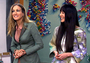
So far we’ve had two challenges that were fairly broad – do something related to motion and make a piece of Pop art – and two based on another piece of art work – the kitsch challenge and this week’s kid’s art challenge. Also, we have yet another week without an artist on the judges’ panel. This week instead, WOA co-producer SJP opined.
As part of this episode, the audience was introduced to New York’s Studio in a School organization. That this organization needs to exist is a sad testament to our society’s misplaced priorities. The arts add so much to life and yet we have to rely on the accident of private initiative to support art education in this one city. What about the kids outside New York? How embarrassing this is for a country with our monetary wealth!
Okay, so I will now step off my soapbox and get on with the show. This week’s challenge for the contestants was to make a work to complement and relate to pieces by their assigned young artists, that is, make a companion piece. This is not the same as making a piece inspired by the student’s work, which some of the contestants seemed to miss.
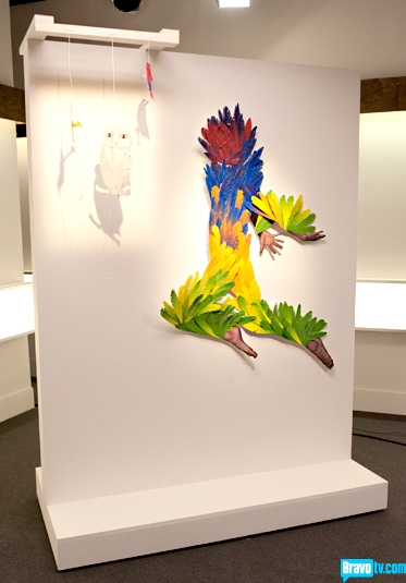
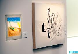 Also this week the contestants encountered the dreaded hidden criteria that the judges considered, such as a childlike playfulness in the work, even if in the dark Roald Dahl mode as in Kymia’s winning piece, Alana’s Story.
On the whole, I thought this week’s work was – top to bottom – the best we’ve seen so far. In addition to Dusty and Kymia, I thought Bayeté’s and Sarah’s pieces were particularly strong. And as a quick aside, is Bayeté the most inconsistent of all? He’s up and he’s down. I thought his piece this week was the best he’s done, but last week’s was tragic. I’m really curious to see what the next week brings from him.
As for the judging, as China would say, it just didn’t work for me. I hate to continue to harp on the absence of an artist on the judging panel, but having someone involved who understands the creative process and how artists move from inspiration to execution should be mandatory.
Can you imagine not having a designer on the panel of judges for Project Runway or a chef for Top Chef? Leaving artists out of the judging demeans the importance of the artist in the process of making art and overemphasizes art as a commodity that can be analyzed simply as a consumer product or an object of intellectual curiosity. I can’t say that the result this week would have been different with an artist as one of the judges, but the results would have had a degree of legitimacy that is otherwise lacking.
Kymia won the week but, though her piece was clever and adroitly finished, didn’t create something that paired with her student’s work as successfully as Dusty’s Portrait for Kei.
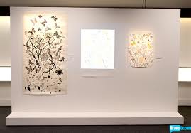
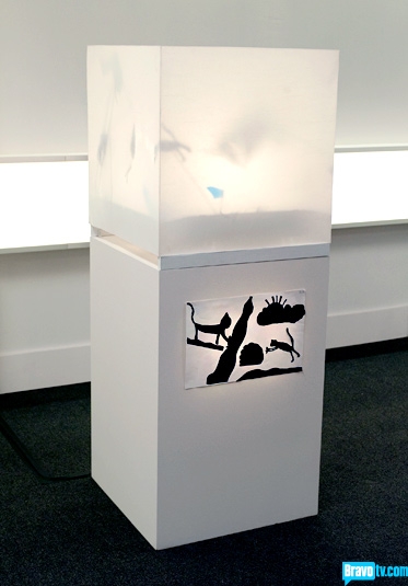
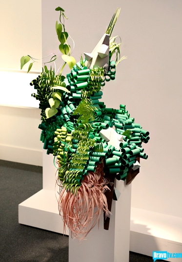
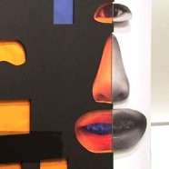 Dusty complemented and elevated Kei’s art. He made the adult, three-dimensional, interactive version of Kei’s work without losing the delicate balance of intelligence and whimsy in the original. Given Dusty’s background as a fifth-grade art teacher, this should have been his week to shine. And while too often those contestants who should do well with particular challenges don’t, Dusty created the best piece of the week.
But I can’t help but feel that Kymia was given the win this week to make up for her not winning last week because Entertainment Weekly vetoed the judges’ choice of Kymia and chose Young instead (see last week’s post). I’m not too upset by that because she should have won last week and her piece this week was quite good. She is proving herself to be one of the best in this group.
As for the lower end of this week’s spectrum, there were only two pieces I thought failed: Morgan/Sucklord’s and Lola’s. Morgan’s was just a sad-looking three-dimensional version of the tree in his student’s painting. Jerry Saltz, while way too dramatic in his movie-quoting-art-diva mode, correctly criticized Morgan for thinking that he can make something special out of something marginal by sprinkling it with Star Wars figures.
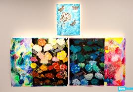
And who knows what Lola was thinking with her crazy and nausea-inducing proliferation of flower prints. She should have just ignored Simon and continued on with her original plan. It couldn’t possibly have been worse than what she threw up on the wall at the gallery show (and, yes, I chose my words carefully).
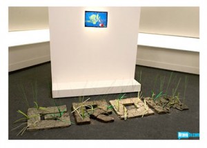
Personally, I thought Tewz was judged unfairly. I found Grow to be a sweet and insightful commentary on what Studio in a School is all about, and the inspiration from his student’s piece was clear to me. The only thing I wish he would have done to make a more direct connection with his student’s piece would have been to maybe paint each of the letters a different color from student’s art.
And no, Bill, it couldn’t have been inspired by any of the student pieces. I do think that Grow was not as much of a companion piece as the challenge warranted, but the same could be said for Michelle’s Down There, which was well executed but just a bit too bizarre and inscrutable (I so wish she had gone with the blood-beaked eye-pecking swans), and Young’s Prism in Flight.
Take care, Tewz. I would have loved to have seen more of your street-inspired art. Your talent will be missed!
So what do you think? Am I way too cranky this week?

