The main strength of the first season of Work of Art – which seems to remain intact for season 2 – was its glimpse inside the artistic process. Even though the process is skewed due to the artifice of the weekly challenge, it is informative to see how different artists approach solving a problem (i.e. to fulfill the dictates of a challenge in a way that meets the judges’ expectations) as filtered through their particular style. Given how derivative contemporary art is, this was a strong first challenge and allowed the artist’s to contrast their own work with something deemed “bad” or “failed” art.
But this is also a reality TV competition, so editing is everything. That Lola was getting the come-from-behind top-three edit was way too obvious, but her piece did succeed with her deconstructed approach that imbued the work with a palpable sense of loss and impermanence with the empty frame from the original piece and the sculpted mountains on the floor. When she described her inspiration, you could see and feel it in the piece.
Sara’s Sexy Pig didn’t work for me as a top three. It wasn’t bad, but I just saw it as a middle-of-the-road entry. I really thought Kathryn’s piece deserved a top three. Her use of the original work was the most creative of the group, and she made something visually arresting that was consistent with her style. Having said that, I am anxious to see if Kathryn’s work is one note with that note being gruesome.
As for Michelle, she may have won because her original piece was the most challenging, and she used it completely intact (plus paint) and made something alluring and thought-provoking about the human struggle with mortality.
Now for the pieces that didn’t work. Morgan/Sucklord put it all in perspective when he said, “I’m just going to slap it on the wall and let other people make up their mind about it.” And indeed he did. I have to admit that I don’t get the whole re-purposed toy thing. It seems like an incredibly narrow perspective, but his passion does come through, which is I think what Mary Ellen Mack responded to (and did I see correctly that Jerry Saltz rolled his eyes at Mary Ellen when she stated support for Morgan’s piece? She should have bitch-slapped him). I think the judges are interested enough in his perspective to keep him around and see what else he can do. But he’d better wow them next week or he may be the next to go.
Next up, Bayeté’s piece: obvious and simplistic in its message and confusing in its approach. This does not bode well for his future prospects on the show. He likes to be provocative and isn’t afraid to make people upset, he says. The only thing that upset me was having to look at something ill-conceived and uninspired. Even after Simon warned him about adding too much stuff, he added more! And he really seemed to be phoning it in.
In Bayeté’s defense, socio-political art is extremely difficult to do effectively, which is why he shouldn’t have attempted this on the first challenge. Let the judges get comfortable with your style and show them your talent before you hit them over the head with a more challenging piece. As it is, he is now on the short-list to be gone unless he impresses them soon.
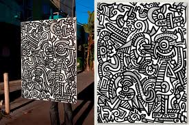
Ugo probably saved Bayeté by creating something that arguably isn’t even art (I know, gasp, that’s a big, scary statement!!). Bill Powers nailed it when he said Ugo’s piece was more wall decor than art. Almost like 3-dimensional wallpaper.
“They say, good artists borrow and great artists steal.” The quote from the late Steve Jobs appears to be a provocative call to jettison creativity and innovations and break the law by committing copyright infringement but was actually only a vehicle for self-congratulations. I don’t know that a gallery owner wants to be known for encouraging theft. So Bill Powers is a fan of Jeff Koons, I guess.
I agree that Ugo’s was bad enough to send him home, but I do think the judge’s critiques were a bit incomplete (possibly due the show’s editing of the critiques). So were they criticizing Ugo for not being derivative enough? Or because he was doubly derivative (with his style and with the original work for the challenge)? Didn’t they see his portfolio?
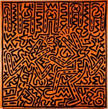
What I take from the piece that Ugo did for WOA is that Ugo’s style is similar to (or evocative of) Keith Haring – one of the most iconic artists of the last few decades – but has no soul, no depth. It’s superficial and, as a result, comes across as merely decorative. Looking at some of Ugo’s other work, it is visually interesting and less referential to Haring than his WOA piece. Ugo’s main problem may be that he doesn’t know what he has to say as an artist. Not to buy completely into the whole suffering-for-your-art meme, but art that works often comes from pain; it comes from adversity; it comes from artists working through their own crap. Otherwise, you may end up with just pretty pictures. While there’s nothing wrong with pretty pictures, we should expect something more from art.
So long, Ugo. You seem like a nice, talented guy. Bonne Chance!
Favorite line:
“Sucklord, you’re up!” China Chow will miss saying that when he’s gone.
Honorable mentions: Sarah’s “And Mouse;” Leon’s “Heaven and Earth.”
What do you think? Should Ugo have stayed? Should someone else have won?


