Episode 3 of WOA offered up a head-on collision between the integrity of art criticism and reality TV’s addiction to product endorsements leaving the integrity of art criticism in traction. Yay! And while they added an artist back to the judging panel this week, it was still very clear who made the final decision on the win.
I can live with the artifice of a weekly challenge so long as the rules are clear and consistently applied. The make-a-piece-of-pop-art part of the challenge was fine, if a bit broad, but the prize shouldn’t have any affect on the artists’ work and most certainly shouldn’t be a factor in choosing a winner.
Even though the art this week was quite good (especially after last week’s debacle), I couldn’t help coming away from this week’s episode feeling disappointed in the show’s treatment of the pieces this week. On the positive side, it looked like most of the artists disregarded Entertainment Weekly’s involvement and just made the pieces they wanted to make. I applaud that. So, enough complaining about things I can’t change. On to the art!
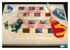
While I don’t think Young’s piece – A Modest Proposition – was the best (even for the judges as I’ll get to later), I do think it was a successful piece of pop art with it’s bright colors, sharp graphics and engaging presentation. As for subject matter, I have to agree with Lola that it is one among many pieces of art over the last couple of years to focus on Prop 8/same-sex marriage and didn’t necessarily add anything new to the conversation. In its message, it was safe and even a bit mundane.
After all, since gay rights in general and same-sex marriage in particular have a tremendous amount of support in the art world, in New York City and in the entertainment industry (represented by Entertainment Weekly and Bravo), Young was preaching to the proverbial choir.
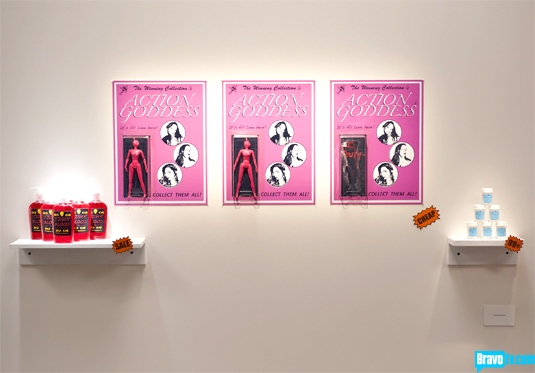
I’m not sure why the judges only chose two pieces for the top spots this week since there were several that were quite good. Another piece that worked well was Morgan’s/Sucklord’s The Winning Collection.
Given the nature of his art, Morgan should have done well this week and succeeded in making a clever statement about celebrity obsession – both the public’s obsession with celebrity and the celebrity’s own obsessions – within the context of consumer culture. This was a classic pop art piece that seemed fresh and original.
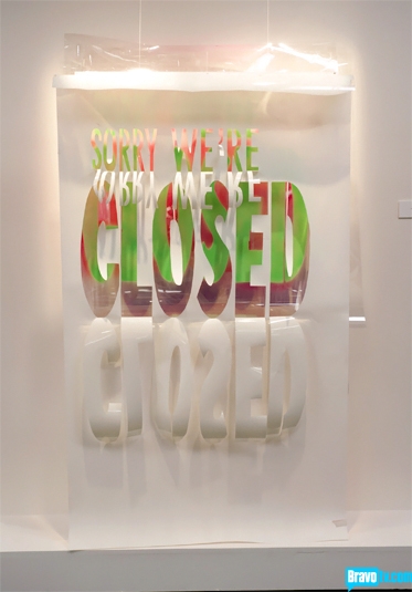
I also really liked Sarah’s B-Fore. She displayed a good understanding of the visual aspects of pop art with her color choices and the graphic/three dimensional quality of her piece that captures the viewers attention in order to communicate a deeper message. This is the one piece that I think you need to see live to truly appreciate its impact.
Was her message too controversial for the prize? Since I’m sure EW has banks that advertise, it probably was. Ironically, what made B-Fore so successful as a work of pop art also made it anathema to EW.
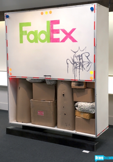
Tewz’s Fad to Black served up a statement on rampant consumerism, our disposable culture and how big corporations feed off and encourage those same behaviors. Tewz had zero chance of having a piece directly critical of a large corporation that spends loads of money on advertising making it into a mainstream publication like EW. But, like Morgan, he succeeded this week by embracing his unique perspective and artistic style.
The graffiti tag on the back took the piece from good to great. This was the stamp of the 99%, if you will, defiantly struggling against the corporate overlords who make it so difficult – if not impossible – to do the right thing. The piece draws you in with those bright pop art colors and a familiar scene before it delivers its indictment.
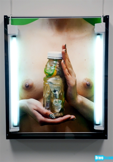
Environmentally conscious art is even more commonplace that art about gay rights, but with Greener Everyday Kymia pinpointed an issue that doesn’t get as much attention as it should. The bottled water industry, inexplicably huge and largely unnecessary in a country with a stable supply of potable public water, persuades millions to continue to buy their product despite the impact on our environment and, potentially, our own health. The industry sells us the idea of a healthy product to make a sexier you.
Kymia’s piece was bold, eye-catching, graphic and thought-provoking. It also had no chance of winning with its unapologetic nudity of the female variety, and in 2011 it is still verboten to present naked female breasts in a mainstream publication. Maybe she should have spray-painted a big E over one nipple and a W over the other to cover up those filthy female parts that the readership of EW has never seen before. Also, as with FedEx and too-big-to-fail banks, I’m sure EW has lots of advertisers who sell bottled water.
Where art is subversive, it forces us to think of our collective hypocrisies and injustices. In that sense, the judging on WOA this week added another layer of ironic complexity to Kymia’s art and demonstrated how so many in the art world view most of America as art-phobic Philistines. Even if most Americans are confused or put-off by most art, especially of the contemporary variety, how will that ever change without exposure?
So Young’s piece was the safest for a mainstream magazine. When the editor was leaving, he said he had chose one that was his “favorite.” When I heard this it stunned me because of how many really good pieces there were this week, but I was making the mistake of considering the pieces as stand-alone art rather than bland magazine fodder.
What it came down to is the judges chose their favorite for the win (Kymia) but EW chose the winner (Young). This is also probably why there were only two finalists for this episode. I hated this outcome, but I have to accept that any challenge that involves and a product endorsement will likely involve so sort of manipulation of the results to satisfy the advertiser. And there you have it!
The pieces that didn’t work this week fell into two categories: they either weren’t pop art or were too derivative. Michelle and Leon were in the latter category borrowing much too heavily from Warhol and Jasper Johns, respectively. I hated to see Leon go because I liked his work the previous two weeks, but What’s in Your Mind really did fail.
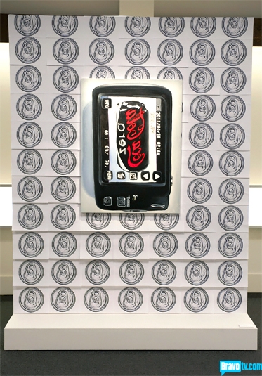
As for Michelle’s Digital Fix, I don’t think I’ve seen such an obvious rip-off in quite a while. And her claim that making the subject Coke Zero rather than Coke somehow made it distinctive and contemporary was laughable. She didn’t even believe it enough to try to be persuasive. It’s unclear what she was thinking, but she barely made it through and only because of the strength of past performance.
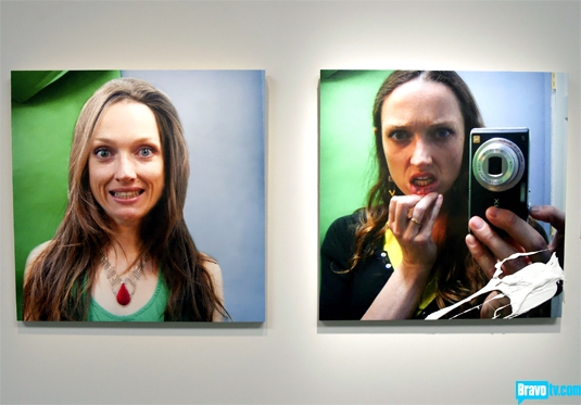
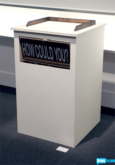
Dusty’s How Could You? and Jazz-Minh’s Bite Me weren’t pop art at all (the same can be said for Bayeté’s Pause: Hapa and Persian, which likely would have sent him home if not for his immunity) and were too subtle and confusing. Jazz-Minh’s piece was inscrutable and, despite her attempt to make lemonade from lemons, suffered from Morgan’s accidental paint splatter.
I was actually surprised that Dusty didn’t join her on the ride home. His piece, while a good idea, was so poorly executed that it receives the dreaded “not art” label of the week. Unless you try to argue for some dada statement here, I don’t see anything that you wouldn’t walk right past in a gallery. I guess, being charitable, you could see it as minimalist/conceptual. But that’s mighty charitable. And after three challenges, I have no idea what Dusty’s style is or who he is as an artist. I think he is one of those contestants that tends to lose his own perspective within the context of challenges. Unless he rediscovers his voice, he’ll be gone soon.
So long, Jazz-Minh and Leon. I’m actually sorry not to get to see more work from both of you. Good luck to you both!
Now that’s enough of my opinions. What do y’all think?

