This week the artists were challenged to create a piece inspired by a pretty broad source: a New York Times’ newspaper headline. The prize was $20,000 and the opportunity to have the winner’s piece on display at the NYT headquarters. Unlike the Entertainment Weekly challenge, no one from NYT appeared on the panel but I sensed their influence nonetheless.
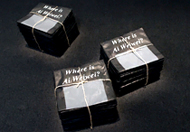
It seems that Young is the favorite for any corporate-sponsored challenge, which is one of way saying that his art is rather safe and innocuous if, on occasion, visually interesting. His winning piece this week with the headline, Where is Ai Weiwei?, would be controversial if on display in China, but expresses an easy sentiment for any country that values freedom of expression.
 It makes a stark statement about censorship (both of the arts and of the press), which is likely why it was chosen as the winner in this particular challenge. Jerry Saltz, in his most inarticulate moment of ridiculous critc-speak yet, went off on some “shouldn’t forget it because it’s yesterday’s news” tangent that I just didn’t understand. Sometimes, the less said the better.
My main criticism of Young’s piece is that I found it a bit literal. You do a piece on censorship that requires some use of newspapers so you just black them out? That’s it?
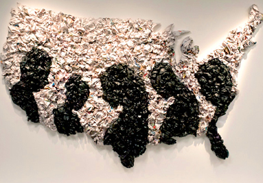
My choice for the win would have been Dusty again this week. I don’t know where this artist was for the first three weeks, but for the last two he has been impressive. I knew that his piece last week could have been a fluke since he was in his element (as he’s a fifth-grade art teacher), but I was disabused of that notion this week.
His piece was visually stunning and, by far, the best use of the mandatory materials (i.e. newspapers) and had an emotional depth that many of the other pieces lacked. Where Young’s piece was about the head, Dusty’s piece was about the heart.
And this is where the corporate-sponsored part comes into play because Dusty’s subject matter, while timely, could be seen as an indictment of our power structure in the U.S., of which NYT is a part. Young’s piece is about somebody else’s problem; Dusty’s is about ours.
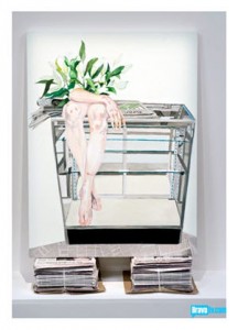
I also liked Michelle’s piece. She was the only one who took a headline and made something highly personal out of it.
Morgan/Sucklord continues to be the luckiest person in the competition (sort of the Mitt Romney of WOA S2) as there is always someone that creates something the judges like less than his. But he’s running out of candidates for such implosions as this:
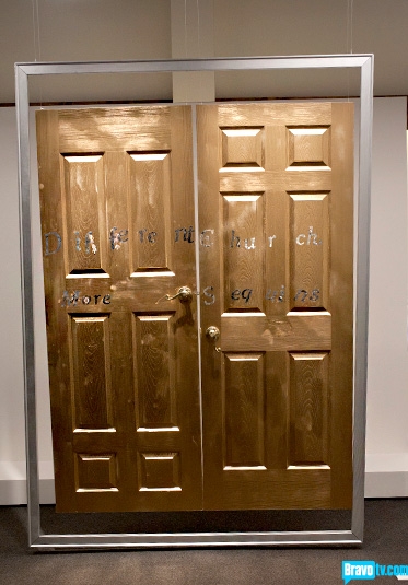
Every once in a while you run across contestants that are so ready to go home that they can’t be bothered to finish a piece well enough to pretend they want to stay. Based on his overall performance on WOA, Bayeté’s strength is in video works. But instead of some cool video we get a sad pair of misaligned doors with some lettering tossed in to meet the challenge’s requirements.
Absent such a lackluster mess, this would have been the losing piece:
I’m not even sure what to say about this one except that it’s never a good idea to come up with a post-hoc interpretation of your piece based on a last-minute addition that you forgot had to be there. People in the art world can smell BS a mile away because they either spout it or have to deal with it all the time. Will another contestant completely screw up next week and allow Morgan to slip by again? I really doubt it. The next time he ends up in the bottom he’s gone.
So Bayeté got shown the door (I couldn’t help myself). Bayeté, I want to see more video pieces from you. It’s where you shine! Best of luck!
Next week: street art. Where’s Tewz when you need him?


